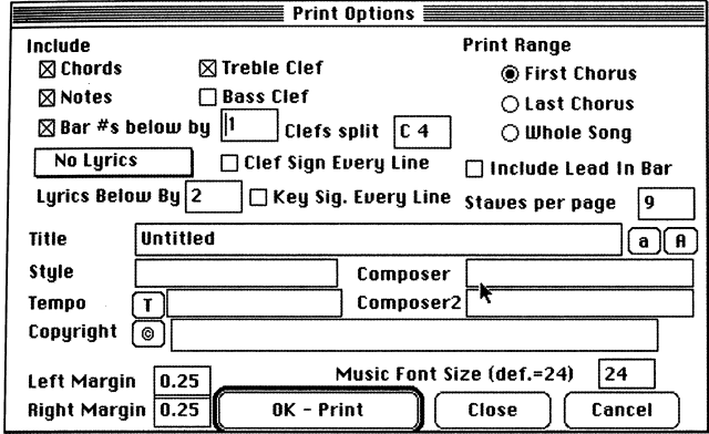
Principles of Interface Design:
Organization & Visual Composition

Dialog box for a music program. Content is not lined up, there is no grouping, and everything is tightly packed together, thus it is hard to detect what buttons, check boxes & fill-ins go to what.

Weak hierarchy and poor organization.

What is most important?

What goes with what?

Poor use of white space