| Created with the Web Accessibility Wizard |
Principles of Interface Design:
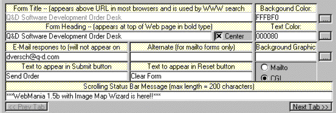
Organization & Visual Composition
Labels are not aligned to the fields they are associated with, causing the eyes to zig-zag around the screen as the user attempts to locate a field of interest.
The choice of color to distinguish labels from editable fields further adds to the confusion.